WPF: Skinning a TreeView with Resources
420 words.
In my first WPF project (a port of a WinForms picture viewer), I needed to create a TreeView with icons on each node. It doesn’t take long to realize that the WPF TreeView doesn’t have this functionality built-in anymore.
I found a bunch of Google resources, but none of them did quite what I wanted. Which was: I wanted to put a folder icon on expandable nodes and a file icon on each leaf. I also wanted an icon to indicate an error condition on the file/folder. Seems like a pretty standard set of requirements to me, but all of the examples I managed to find only showed you how to put the same image on every node or leaf.
First I tried “skinning” the images in the XAML as shown here. That didn’t work, because as I said above it only put the same image on every node.
Next I tried programmatically adding the images (also shown here) by putting a StackPanel in each TreeViewItem.Header. That didn’t work either, because it stopped indenting the TreeView, not to mention that all of the collapse/expand icons disappeared!
From the XAML examples on Google, it seemed clear that I needed to set the TreeViewItem.HeaderTemplate property instead of Header. So I next tried to programmatically create a DataTemplate for use with HeaderTemplate. That quickly devolved into a syntactic nightmare, so I went back into the XAML.
After some more stumbling around I finally ended up defining a DataTemplate resource for each type of node I wanted.
«/font>TreeView Name=“tvFiles” Grid.RowSpan=“3″ Loaded=“tvFiles_Loaded” SelectedItemChanged=“tvFiles_SelectedItemChanged” Margin=“0,0,12,0″>
«/font>TreeView.Resources>
<!- These templates are accessible through tvFiles.Resources ->
«/font>DataTemplate x:Key=“GreenFolder”>
«/font>StackPanel Orientation=“Horizontal”>
«/font>Image Source=“icon_folder.gif” Margin=“0,0,2,0″ />
«/font>TextBlock Text=”{Binding}" FontWeight=“Bold” />
</StackPanel>
</DataTemplate>
«/font>DataTemplate x:Key=“RedFolder”>
«/font>StackPanel Orientation=“Horizontal”>
«/font>Image Source=“icon_folder.gif” Margin=“0,0,2,0″ />
«/font>TextBlock Text=”{Binding}" FontWeight=“Bold” Foreground=“DarkRed” />
«/font>Image Source=“icon_warning.gif” Margin=“2,0,0,2″ />
</StackPanel>
</DataTemplate>
«/font>DataTemplate x:Key=“GreenFile”>
«/font>StackPanel Orientation=“Horizontal”>
«/font>Image Source=“icon_picture.gif” Margin=“0,0,2,0″ />
«/font>TextBlock Text=”{Binding}” />
</StackPanel>
</DataTemplate>
«/font>DataTemplate x:Key=“RedFile”>
«/font>StackPanel Orientation=“Horizontal”>
«/font>Image Source=“icon_picture.gif” Margin=“0,0,2,0″ />
«/font>TextBlock Text=”{Binding}" Foreground=“DarkRed” />
«/font>Image Source=“icon_warning.gif” Margin=“2,0,0,2″ />
</StackPanel>
</DataTemplate>
</TreeView.Resources>
</TreeView>
Then in the code that populates the TreeView, I grabbed the appropriate DataTemplate from the TreeView.Resources collection and set the HeaderTemplate property.
TreeViewItem item = new TreeViewItem();
item.Header = text;
if( isDir )
{
item.HeaderTemplate = hasDescription ?
(DataTemplate)tvFiles.Resources[“GreenFolder”] : (DataTemplate)tvFiles.Resources[“RedFolder”];
}
else
{
item.HeaderTemplate = hasDescription ?
(DataTemplate)tvFiles.Resources[“GreenFile”] : (DataTemplate)tvFiles.Resources[“RedFile”];
}
nodes.Add( item );
It ended up looking like this:
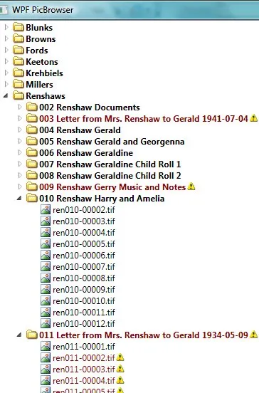
It’s a much more powerful and flexible TreeView in WPF, but it’s sure a lot more work to add icons than it used to be.
Sorry, new comments are disabled on older posts. This helps reduce spam. Active commenting almost always occurs within a day or two of new posts.